Comparison View

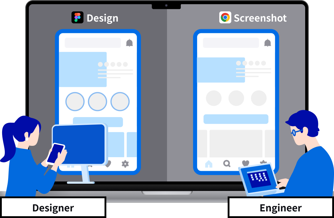
Differences Clearly Shown in Side-by-Side Screens

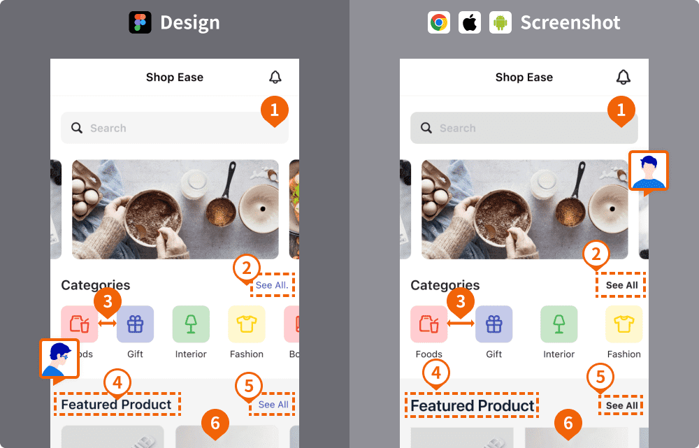
Visual Representation of UI Differences: Fonts, Margins, Sizes, Colors, and More
See the Differences Between Design and Implementation Instantly with UI SCAN's Comparison Screen.Make corrections and run another scan for quick and effective UI quality improvement.

Practical Tool for Smooth UI Difference Review
UI differences span from text fonts, element margins, sizes, to colors, and there are tools available to clearly convey these specific variances.Tools to enhance design check efficiency
We have prepared tools to improve work efficiency, such as checking colors and sizes, and enabling conversations with team members.
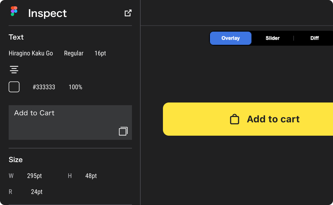
Understand the correct values of components
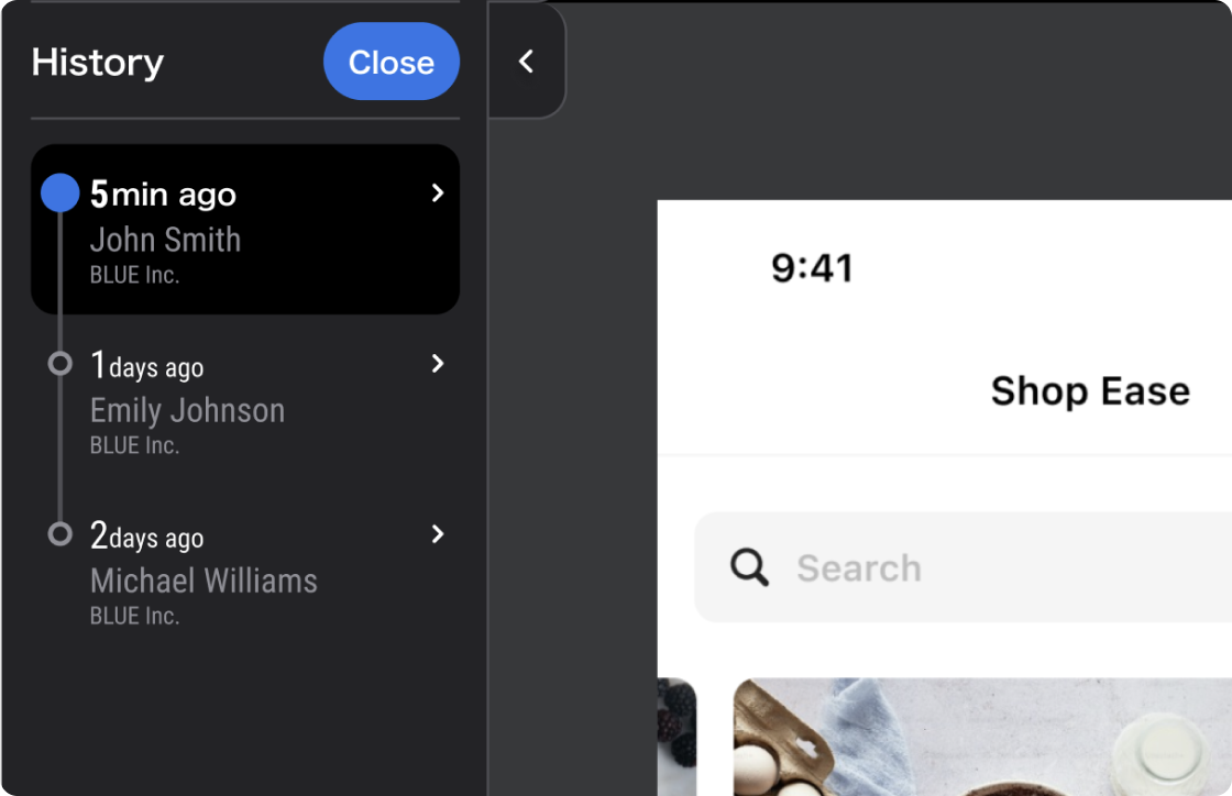
Component information and style guides from the design file can be readily viewed in the Inspector column. Swiftly addressing frontend development requirements is possible through a precise understanding of values.Improve Review Process with Version History
Updates are accompanied by version history, allowing you to stay up-to-date and easily track changes.
Free Beta Version Available
Inquire about implementation